The Band
Goal: creation, content placing and promotion of the website for brand promotion of the hookah-coffee club “The Band”. Developers of the website had number of non-standard tasks for integration of the specific business work, and they managed to find optimal solutions.
http://thebandco.ruTHE BAND - hookah coffee club
A place for gourmets and aesthetes, for those who appreciate professional service, high-quality shishas and comfortable rest!
A good hookah is an art that is not available to everyone. In «The Band» - you will forget about the question: «Why so little smoke?» Also, you can enjoy a pleasant musical accompaniment, as a snack to the smoke and in the tone of atmosphere.
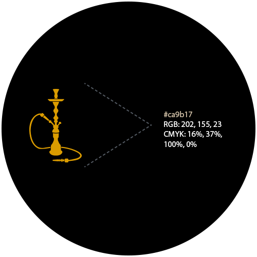
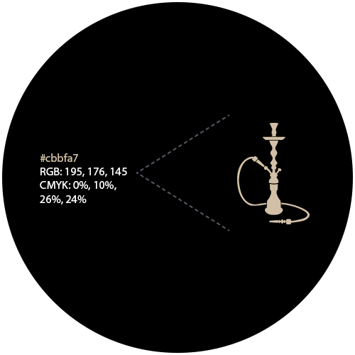
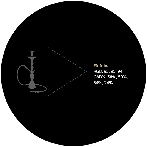
Font and color palette
For the main texts on the website, a font set with sans serifs Arial was chosen.
Arial - the computer font of the neo-grotesque class and the Helvetica family. It has modifications: Arial Black, Bold, Extra Bold, Condensed, Italic, Light, Medium, Monospaced, Narrow and Rounded.
Pinakothek
The gallery will instantly tell you what the site is about and help with positioning: what are you offering and for whom.
We have selected and retouched in a same style all the high-quality photos according to the legislation of the Russian Federation, which still can convey the meaning and the atmosphere of the facility.
«Hot» reportage
The company's image suffers from a lack of vital signs on the website. A regularly updated site is quite useful at least for the search engines, so this is a faster and an easier way to get into the TOP.
For the further promotion of the site, the sections on the hookah events and bandablog were implemented, in which one can see life of both, the hookah club separately and hookah business in general.
Map and location map
Most of the townspeople do not always know the street names, even nearest one, the graphic mark on the map increases the chance that a person will recognize the place and will go to you, as your facility is in the closest proximity.
We have developed a contrasting color scheme of the map, which is comfortable for the eye. Also we made a large-scale scheme of how to find our customer in a densely populated Moscow.
Adaptive site
Show us a person, who will enjoy the small print on the website’s mobile version and then we will not insist on the adaptability of your site. It is already XXI century and technologies are changing and so are we. Join us!
Our projects
Discuss your project with us!
We are always open to dialogue. Write to us, and we will consult you with a pleasure, answer your questions and advise you the best solution.